如何使用Vue及其内置组件Teleport快速实现模态框。
您可以在这个GitHub仓库中找到一个示例Laravel项目。
尽管在网站上使用模态框可能看似简单,但它的实现有时可能很复杂。为了简化这项任务,Vue框架引入了其内置组件<Teleport>。此组件使我们能够将组件模板的一部分“传送”到组件DOM层次结构之外的现有DOM节点中。
现在让我们确定外部节点的位置,将id capsules 赋予 Welcome.vue。
/resources/js/pages/Welcome.vue
<script setup>
import logotype from '/public/assets/capsules-logotype-red-blue-home.svg';
</script>
<template>
<div id="capsules" class="w-full min-h-screen flex flex-col font-sans text-primary-black">
<div class="grow mx-8 lg:mx-auto max-w-screen-lg overflow-auto flex flex-col items-center justify-center text-center">
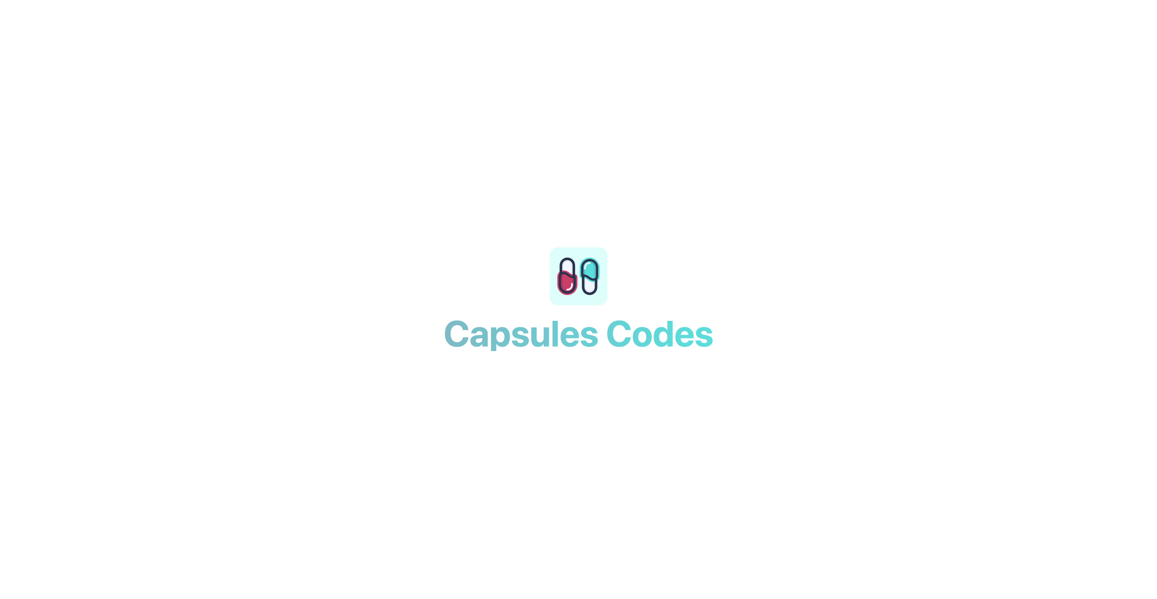
<img class="w-24 h-24" v-bind:src="logotype">
<h1 class="mt-4 text-6xl font-bold select-none header-mode" v-text="'Capsules Codes'" />
</div>
</div>
</template>
该Vue组件实际上是InertiaJS页面,在访问在web.php文件中指定的主路由时调用。
routes/web.php
<?php

use Illuminate\Support\Facades\Route;
use Inertia\Inertia;

Route::get( '/', fn() => Inertia::render( 'Welcome' ) );
现在id capsules 已分配,Modal.vue 组件将能够在这个元素上使用内置的<Teleport>组件。
/resources/js/components/Modal.vue
<script setup>

import { ref, onMounted } from 'vue';

const props = defineProps( { open : { type : Boolean, default : false } } );
const emits = defineEmits( [ 'toggle' ] );

const ready = ref( false );

function toggle()
{
    emits( 'toggle' );
}

onMounted( () => ready.value = true );

</script>

<template>
    <Teleport to="#capsules" v-if="ready">
        <Transition enter-active-class="duration-500 ease-in-out" enter-from-class="opacity-0" enter-to-class="opacity-100" leave-active-class="duration-500 ease-in" leave-from-class="opacity-100" leave-to-class="opacity-0">
            <div v-if="props.open" class="fixed w-full h-full flex items-center justify-center backdrop-blur-[1px] bg-primary-white bg-opacity-50" v-on:click="toggle()">
                <div class="relative m-16 p-2 rounded-xl flex flex-wrap items-center justify-center text-xs bg-white whitespace-pre shadow-2xl shadow-black/10" v-on:click.stop>
                    <slot />
                </div>
            </div>
        </Transition>
    </Teleport>
</template>
ready 变量允许组件加载,以便尽可能平滑地触发其转换。
另一方面,v-on:click.stop 事件可以防止任何潜在点击传播到模态本身以外的元素。
内置的<Transition>组件可以用于对其通过默认槽传递的元素或组件应用进入和退出动画。在这种情况下,它涉及平滑的透明度转换。
完成模态配置后,现在需要创建一个组件来显示该模态。在这个例子中:一个按钮。
resources/js/components/Button.vue
<script setup>
import { ref, watch } from 'vue';
import Modal from '/resources/js/components/Modal.vue';
import logotype from '/public/assets/capsules-logotype-red-blue-home.svg';
const button = ref();
const isModalOpen = ref( false );
watch( () => isModalOpen.value, () => isModalOpen.value ? window.addEventListener( 'click', clickOutside ) : window.removeEventListener( 'click', clickOutside ) );
function clickOutside( event )
{
if ( event.target === button.value || !event.composedPath().includes( button.value ) ) isModalOpen.value = false;
}
</script>
<template>
<div ref="button" class="m-4">
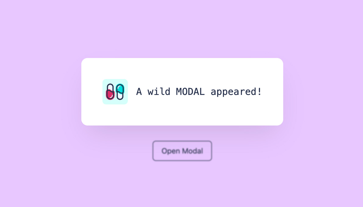
<button class="px-4 py-2 text-sm rounded-md border border-primary-black hover:border-primary-red hover:text-primary-red transition-all" v-on:click="isModalOpen = true" v-bind:class="{ 'opacity-25' : isModalOpen }" v-bind:disabled="isModalOpen" v-text="'Open Modal'" />
<Modal v-bind:open="isModalOpen" v-on:toggle="isModalOpen = false">
<div class="p-8 flex flex-row space-x-4 rounded-lg">
<img class="w-12 h-12 select-none" v-bind:src="logotype">
<div class="font-mono flex items-center">
<h2 class="text-lg align-middle" v-text="'A wild MODAL appeared!'"/>
</div>
</div>
</Modal>
</div>
</template>
创建了一个名为button的变量,并将其与Modal的父div关联,以便我们可以监控所有在此组件之外做出的点击。使用了一个watcher来观察isModalOpen变量,以确定在屏幕上点击时是否应该触发clickOutside函数。如果模态打开,则函数被激活;否则,则不激活。
可以将Button.vue组件添加到Welcome.vue页面。
resources/js/pages/Welcome.vue
<script setup>

import logotype from '/public/assets/capsules-logotype-red-blue-home.svg';

import Button from '~/components/Button.vue';

</script>

<template>
    <div id="capsules" class="w-full min-h-screen flex flex-col font-sans text-primary-black">
        <div class="grow mx-8 lg:mx-auto max-w-screen-lg overflow-auto flex flex-col items-center justify-center text-center">
            <img class="w-24 h-24" v-bind:src="logotype">

            <h1 class="mt-4 text-6xl font-bold select-none header-mode" v-text="'Capsules Codes'" />

            <Button class="pt-8" />
        </div>
    </div>
</template>
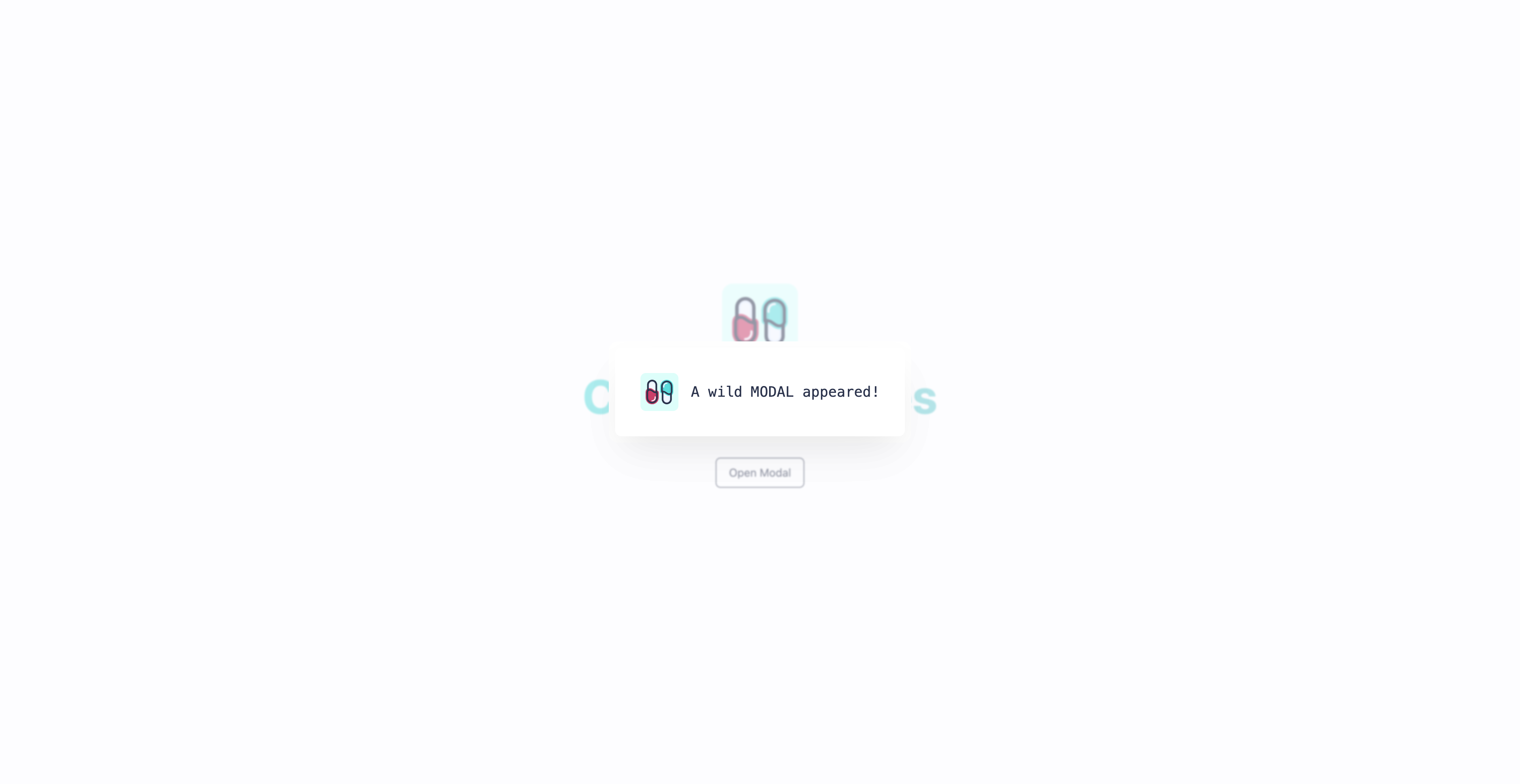
点击按钮时会出现Modal。现在可以自定义模态,包括其位置、尺寸和动作。在Capsules Codes Blog上实现的Reaction组件也是使用这种方法的结果。
很高兴这有所帮助。
driesvints, massimoselvi, mho 认可了这篇文章


 Laravel
  Laravel News
  Laracasts
  Laravel Podcast